 Fig 1. Google Ban™ screenshot through IE; 13,400 queries made in the span of approximately two hours
The datasets are partitioned by the host which I told Google to search within. I originally contrived an idea that I would somehow compare and contrast BBC, LiveJournal, Blogspot, and the general English corpus, but because of the nuissance posed by the wide fluctuation in the wordcount per webpage, I grew weary of trying to formulate insightful commentary that the data would support. The lazy bastard and quitter that I am, I shelved the idea of writing about the findings - or lack of findings - until this very epiphanal moment when writing about such a thing became the least boring in the long list of nauseatingly boring things I could be whiling away my time at.
 Fig 2. x-axis represents frequency rank, 1 being highest; y-axis represents frequency in units of webpages per billion in domain-specific corpora as measured by Google; dataset contains 3,500 randomly selected words from the 1913 Unabridged Merriam-Webster dictionary queried against each of 4 domains
The horizontal axis represents the ranking order of a word by descending frequency. That is, x=1 represents the most frequent word for each particular dataset, which may be "the" for one set, and may be "an" for another set; and x=383 represents the 383rd most frequent word for each particular dataset. The purpose of keeping things in descending order of frequency is to form a Zipf curve, which is visually smooth and tenders brownie points for allowing me to mention Zipf.
The vertical axis represents the search results returned by Google, multiplied by a coefficient that lets us pretend the most frequent word of any dataset has 1 billion search results. This multiplicative shifting was necessary to make the superimposition of datasets in a single plot less jarring. Unfortunately, such arithmetic jugglery creates jagged artefacts near the tail-end of the curves, as the words become less frequent. This unsightliness is the graphical pronouncement of integer search results multiplied by what was necessary to make the most frequent word show up as 1 billion. Under a log scale plot, there is little difference between y=1023 and y=1024, but quite a bit of difference between y=1 and y=2.
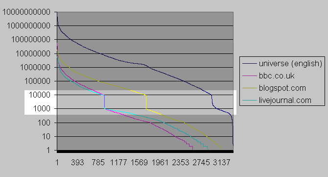 Fig 3. unscaled version of Figure 2
A notable, consistently reappearing anomaly is a discontinuity in the curves. This discontinuity, what I would dub The Google Chasm were it not for my vanity insisting on it being called The Thoreaulylazy Plunge, shows a steep dropoff in search results once the search results reduce to a navigable amount, which is 1,000 if you ever care to try to navigate to further and further pages in the google resultset.
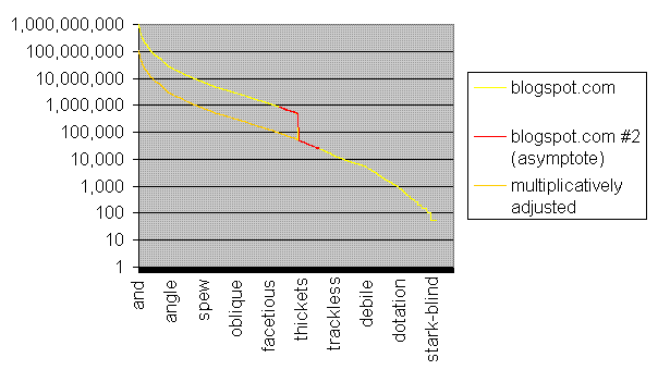 Fig 4. asymptotic region requeried the following week to check for reproducibility; plausibly inflated results multiplicatively deflated through division by 10 (approximately)
As a logical being, I would exhaust all avenues of explanation before spouting off fervently in an accusing tone. That said, I am baselessly laying the blame squarely on a Google conspiracy to inflate search results by a factor of ten once the results are no longer navigable and hence no longer easily verifiable. At some point, I should access the Google APIs under the free academic license and find out once and for all what this crevasse is all about. A mosey down into yahoo-land and a repeat of this data mining escapade may also prove fruitful as ammunition in my Google conspiracy claim. Ah, who am I kidding, I'm not persistent enough to furnish any evidence.
| universe | bbc.co.uk | blogspot.com | livejournal.com | |
| 1 | and | and | and | not |
| 2 | home | home | that | add |
| 3 | site | help | not | help |
| 4 | information | policy | home | and |
| 5 | that | skip | they | site |
| 6 | help | not | no | ask |
| 7 | policy | that | site | information |
| 8 | not | e | don | lost |
| 9 | e | responsible | see | yahoo |
| 10 | see | site | them | e |
| 11 | no | see | very | press |
| 12 | program | they | today | policy |
| 13 | press | edition | old | legal |
| 14 | they | related | big | that |
| 15 | related | northern | every | every |
| 16 | science | watch | place | kind |
| 17 | them | pictures | help | no |
| 18 | today | science | found | don |
| 19 | network | no | though | anyone |
| 20 | skip | them | photo | looking |
| -5 | direfrench | gristmill | galopade | meruit |
| -4 | vorspielgerman | congeries | exaltee | appurtenant |
| -3 | grstorgegr | enthymeme | conferva | inexpugnable |
| -2 | slipstickcoll | nosce | pegomancy | livraison |
| -1 | metrongr | federalize | solecize | chronogram |
No comments:
Post a Comment